Logo for “The Junction at Destination” – A Bold Mixed-Use Redevelopment in Fayette County, Ohio
We are seeking a bold, modern, and versatile logo for The Junction at Destination — a major adaptive reuse project that is transforming a former outlet mall into a dynamic mixed-use lifestyle and business center.
True to its name, The Junction will be a place where people, industries, and services come together. The development will offer:
• Flexible office space for businesses supporting regional growth
• On-site daycare and urgent care to meet the everyday needs of working families
• Dining options and a fitness center to promote wellness and convenience
• Light industrial and warehousing space to support logistics and operations
By blending commerce, community, and functionality in one location, The Junction at Destination will become a key asset in the area’s economic and social development.
$199
STANDARD
343
ENTRIES
BRIEF
DESIGNS (343)
Design Briefa year ago
Logo Name:
The Junction at Destination
Company Intro:
Logo for “The Junction at Destination” – A Bold Mixed-Use Redevelopment in Fayette County, Ohio
We are seeking a bold, modern, and versatile logo for The Junction at Destination — a major adaptive reuse project that is transforming a former outlet mall into a dynamic mixed-use lifestyle and business center.
True to its name, The Junction will be a place where people, industries, and services come together. The development will offer:
• Flexible office space for businesses supporting regional growth
• On-site daycare and urgent care to meet the everyday needs of working families
• Dining options and a fitness center to promote wellness and convenience
• Light industrial and warehousing space to support logistics and operations
By blending commerce, community, and functionality in one location, The Junction at Destination will become a key asset in the area’s economic and social development.
Instructions:
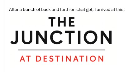
UPDATE - I ADDED something that I now want to go in the direction of after seeing all so far. See attached. It's a logo I worked on with ChatGPT as a base. Also, see our brand guide that you can use for colors/fonts. The colors should match the file that is attached. That is the parent company.
Design Goals:
Style: Clean, strong, forward-looking
Tone: Bold, professional, community-centered
Color Palette: Should work harmoniously with the existing Destination Outlets logo (red, black, white) (ATTACHED).
Flexibility: Logo should work across web, signage, print, and social media.
Logo Must Include:
Primary Name: The Junction at Destination
(You may emphasize “The Junction” as the lead identity)
Structured and clear — not busy or overly complex
You can view the Destination Outlets logo [attach image or link] — your design should complement, not clash with it. https://www.destinationoutlets.com/ tghe logo: https://prnt.sc/08r1vWowj79a
Preview
Screenshot_21.jpg
DestinationOutlets_BrandingGuidelines_2022.ai
B
bkonvesa year ago
See updates. We do not like any we have seen so far, so we went to ChatGPT and came up with one that we want. You can use that for inspiration. We also gave you the brand guide for the colors.
Must be strong and powerful.
I don’t think we need an icon at all, unless they are so talented that it doesn’t look cheesy. We need clean and confident. They can use colors from the expanded Destination Outlets color pallet if they’d like – it’s included in the branding kit I sent you.
hasibhasan selected as finalist!a year ago
sheilavalencia selected as finalist!a year ago
Design Concepts Completeda year ago
Open design concept stage had ended with 343 submissions from 58 designers. Go to DESIGNS tab to view all submissions.

 hasibhasan
 sheilavalencia
 yunda
yunda
 Ahmad Subahman
 superbeam
 Girly
Girly
 ATTACK
 Neng Khusna
 cintoko
 cwrproject
 Queen D

 Marena
 Sami Ur Rab
 Paradiseg
 Lordede
 Hadisk
 Ayamas
 Octavino
 zonpipo1
 wriddhi
 Snapp
Snapp
 banaspati
 luckyprasetyo
 CreativeKiller
 Rahul Biswas
 yoppunx
 jaize
jaize
 WIWIN HARYADI
 Rainbow07
 artery
 laras fafa
 Gwerth
 Poki
Poki
 Suvendu
 Artomoro
 scania
 one
one
 sodimejo
 Franky.
 IamSoya
 Amne Sea
 ndaru
ndaru
 puthreeone
 ALLfiles
 AB212
AB212
 Boomstudioz
 almaula
 LogoQueen
 Koushik
 maze
maze Ariza Mauliza
 oindrila
 bigboss
 goblin
 Bright Ritchil
 Diponegoro_
 beejo
beejo