
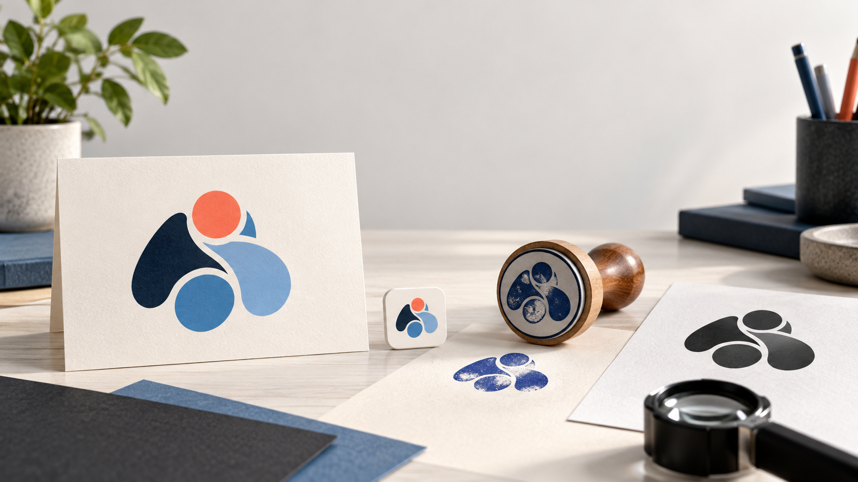
Updated October 2026. A logo can look impressive on a large presentation board and still fail when it is printed on a receipt, embroidered on a shirt, or viewed from a moving car. Detail is not automatically a problem, but every line, color, letter, and effect asks the viewer to process more information. If the main idea disappears when the logo gets smaller, the design is carrying more than it can usefully communicate.
The solution is not to remove personality. It is to test whether the identity stays recognizable and appropriate in the places your customers actually meet it. These eight checks give you a practical way to decide whether a logo needs simplification before printing, wrapping a vehicle, ordering uniforms, or launching a website.
What “too complicated” really means
A complicated logo may contain too many visual ideas, but complexity also appears in less obvious ways. A long name in a tiny type size can be difficult to use. A thin outline may vanish on fabric. Several near-identical colors can create noise without adding meaning. An icon may be technically simple while its relationship to the name is confusing.
The right level of detail depends on the business and the applications. A restaurant may have an illustrated illustration for a menu cover and a reduced mark for a favicon. A construction company may use a bold vehicle lockup and a one-color stamp. A small online business may need a wordmark that stays legible in a browser tab. Think in terms of a logo system with appropriate versions, rather than forcing one artwork file into every situation.
Test 1: Shrink it to the smallest real use
Open the logo at the smallest size customers will see. Use the actual social avatar, browser icon, email signature, packaging label, or uniform patch rather than an arbitrary thumbnail. Ask whether the name can still be read and whether the symbol remains one clear shape. If you need to explain what the tiny mark contains, it has lost too much detail.
Do not solve a small-size problem by scaling the entire logo until it is unreadable. Ask for a compact configuration or simplified symbol. A wordmark may work at one size while an icon or initials work at another. The goal is recognition, not a miniature copy of the largest presentation.
Test 2: View it from a distance
Step back from the screen, print it and walk across the room, or view a vehicle mockup at the distance people will actually have. At a distance, detail becomes texture. The eye notices the overall silhouette, the contrast, and the name’s shape before it notices small decorative choices.
This check matters for storefronts, trade-show signs, service vans, outdoor banners, and event backdrops. If the business name blends into the icon or the whole mark becomes a dark blob, increase the hierarchy and remove competing elements. The seven-point checklist for comparing logo designs can help you evaluate the concept in its actual applications.
Test 3: Convert it to one color
Make a solid black version and a reversed white version. This reveals whether the logo depends on gradients, color differences, shadows, or thin outlines to make sense. A one-color version is useful for invoices, stamps, embroidery, photocopies, engraving, and inexpensive print production.
One-color testing also shows whether the internal spaces are doing enough work. Shapes that are distinct in blue and orange may merge when they share one ink. Simplify the silhouette or increase the gaps until the mark is still easy to recognize. NYC’s official logo design guidelines recommend simple, recognizable marks that function across media and in black and white, a useful standard for a small business identity.
Test 4: Remove the color
View the logo in grayscale and squint at it. Are the important shapes still visible, or does the design only work because two similar hues are separated? Color can carry emotion, but the basic idea should remain clear when lighting, printing, or display conditions change.
If color is essential to a particular brand meaning, preserve it in the primary version and create a reliable monochrome alternative. Check the contrast of the logo and the background in each place it will appear. The W3C guidance on non-text contrast explains that graphics needed to understand content should have sufficient contrast, while brand logos have a specific exemption; that distinction still makes strong contrast a practical choice for readability and recognition.
Test 5: Describe the idea in one sentence
Ask three people to describe what they see without giving them the brief. Listen for the main idea, not a perfect interpretation. If every person names a different symbol, the logo may contain too many competing messages. If they notice the intended tone and can identify the name, the concept is doing its job.
A logo does not need to literally explain every product or service. It needs one memorable, appropriate cue that can gain meaning as customers experience the business. If you have combined a house, leaf, globe, gear, star, initials, and tagline, decide which element has the strongest reason to stay. A designer can preserve the core idea while removing visual noise.
Test 6: Check the name and icon separately
Hide the symbol and read the wordmark on its own. Then hide the name and inspect the icon alone. Each part should have a clear role. The wordmark should be readable and have a personality that fits the business. The icon should have a coherent silhouette rather than a collection of tiny objects.
This test also reveals whether the lockup is too dependent on a tagline. Taglines can be useful in campaigns, but they often disappear at small sizes. Keep optional wording outside the core logo unless it is truly required. New businesses frequently need the name to do the recognition work first, so a clear wordmark or combination mark can be more useful than a symbol that only makes sense after explanation.
Test 7: Put it beside real competitors
Create a quick board of the businesses customers may compare with you. Include their logos at the size and distance where people encounter them. Does your mark disappear into the same color, badge, icon, or type style? Or does it feel so unusual that it signals the wrong category?
The goal is a clear position. You can use a familiar visual language without repeating every cliché. A simpler mark often gives you more room to be distinctive through a single shape, a confident name treatment, or an unexpected but appropriate color. If the design resembles another mark closely, investigate availability before committing. Visual preference cannot answer trademark questions on its own.
Test 8: Ask whether it survives everyday production
Send the logo through the production methods you will use first. Print it on ordinary office paper, view it on an inexpensive screen, place it on a dark shirt, test an embroidered patch, and create a small label. Look for lost gaps, uneven strokes, muddy colors, and awkward crops. Ask the printer or embroiderer what artwork they need before you approve the final package.
Keep organized versions for light and dark backgrounds, horizontal and stacked layouts, one-color use, and small applications. The logo design mistakes guide covers missing handoff files and weak small-format performance, two problems that are easier to fix before production begins.
How to simplify without making the logo generic
Start by naming the one idea the logo should own. Remove decorative details that do not support it. Combine repeated shapes. Increase the size of important lettering. Use fewer colors with stronger contrast. Replace a detailed illustration with a distinctive silhouette or negative-space gesture. Preserve the feature that makes the concept yours, then make everything around it quieter.
Simplification is also a chance to build a useful family of versions. A full lockup can appear on a website header. A reduced icon can appear on a social profile. A one-color mark can appear on a stamp. These versions should feel related and be supplied as intentional artwork, not improvised crops after the fact.
When detail belongs in the wider identity
Some visual detail can move out of the logo and into the brand identity. A business may use illustration, patterns, photography, or a richer color palette in menus, packaging, social posts, or campaign graphics while keeping the core mark simple. This gives the wider brand room to express personality without making the identifier carry every message.
If your business needs several customer-facing materials, consider a logo plus identity project. The difference between a logo and a brand identity explains how the surrounding system can make the mark feel consistent across web, print, packaging, and physical spaces.
Make the final decision with evidence
A logo is ready for printing when customers can recognize it quickly, the name remains readable, the core idea survives in one color, and the artwork behaves in the places you need it. Use the eight tests on each finalist and record the practical issue behind every requested change. That gives your designer a clear direction and gives your team a reason for the final choice.
A simple logo is not an empty logo. It is a design that has decided what matters. When you remove the details that compete with the name and the main idea, customers have a better chance of remembering the business behind the mark.